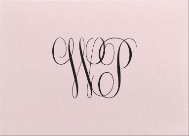
I have a little bit of a letter writing obsession and love beautiful paper goods, so I was all kid-in-a-candy-store when I started looking for monogrammed personal stationery to use for thank you notes before the wedding. Once I finally decided on informals, I spent ages deciding on the monogram design, colors, paper, and envelope liner. I landed on this design from Crane & Co:
It’s a pretty hand-engraved, embossed style, but I think my favorite part of the whole design is the sweet black and white polka dot envelope liner. It’s the little details that make life beautiful, you know? 🙂
I really wanted to have a monogram with my middle initial “J” but the script fonts were just hideous. Crane & Co., you really need to improve these, stat. Look at that atrocity… it looks like an “F” or a “G” and that “W” is pretty heinous too:

Finally, this monogram design had a really old-school, vintage/collegiate-vibe that had me smitten but it wasn’t quite right. I may come back to it for future personal stationery:

So that’s that. The stationery is ordered and should be here in a week; I can’t wait to finally see it! But before I wrap-up, can I just vent for a minute about how difficult it was to find a resource with social stationery guidelines? What is the correct paper weight? Is a flat card too informal? Are “informals” too formal? So many questions with no answers!!
Here is the best resource I found: Proper Use Of Social Stationery but I think I’ll write something more comprehensive up after the wedding, so stay tuned.
Phew, that felt good.
xoxo, Wend

